Showing posts with label artrage. Show all posts

Tuesday, July 22, 2014

TOR: Rivendell

No title puns today. The Rivendell book for The One Ring RPG is out in PDF and in preorders for the physical copies!

http://rpg.drivethrustuff.com/product/132859/Rivendell?affiliate_id=169435
http://shop.cubicle7store.com/Rivendell

I've painted and drawn a few pieces for the book. And they were great scenes and objects - battles, armies, swords and helmets, but I can't help but think the resulting illustrations could've been better.
I don't mean to blame the circumstances in which they were made (the last few months my mum was still with us), but it's true my mind was not focused on the work as it should've been.


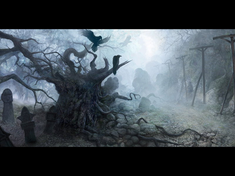
"Armies of Arnor and Lindon are coming down from the Misty Mountains."
(This one was a struggle. I drew this at my parents' house, so I had to do it on paper instead of the usual "digital pencil". And by accident, I used a piece of watercolour paper, which is very bumpy and hard to draw on. At least for me.)
The only original piece of the bunch, I already gave away as a thank you to a fan who bought several other paintings of mine.


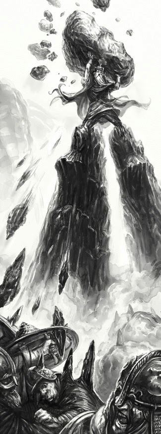
"Witch King flees from lord Glorfindel after the battle of Fornost" 
This one's alright. Glorfindel came out fine, but I wish I spent more time fiddling with Witch King's design. The colour scheme is odd, but works, more or less. I originally wanted to show more of the battle in the background, but ended up focusing on the front figures.


"Glorfindel in Rivendell"
Glorfindel is one of those characters almost impossible to depict as you imagine them. (primarily because I don't have a concrete singular image of them in my mind. So I pretended to be Victor Ambrus and also started experimenting with the tools in ArtRage in the middle of the drawing. Came out sort of ok. 


"And so, the game of golf was invented..."
Golfimbul's death at the hands of Bullroarer Took was a super fun scene to do. Unfortunately, I drew it at my absolute physical and psychological low at the time. Still, I think both comedy and action of the scene came through.


"Helmet and sword from the times of old"
Yeah, this was the safest one. I just switched my brain off and painted what I knew. Now I wish I did the helmet even more like Tolkien's karma, but it might've been too weird. The sword is an odd mix of elements, really! Quasi-Migration/early medieval period fittings and handle, Tibetan/Chinese influence on the hilt decorations and a pommel that's half yataghan and half ancient bronze Persian dagger.


That's all! Jon and I were joined by Jeremy McHugh for this one. And trust me, he's done a great job. So go now, go buy the PDF and/or preorder the book!
-----------------------------------------------------------------------------------------------------------
"The One Ring, Middle-earth, The Hobbit, The Lord of the Rings, and the characters, items, events and places therein are trademarks or registered trademarks of the Saul Zaentz Company d/b/a Middle-earth Enterprises and are used under license by Sophisticated Games Ltd and their licensees."

Friday, December 13, 2013

Games of the Mighty And Powerful


Dračí Doupě II: Hry mocných (Dragon's Lair II: Games of the Mighty) is a supplement rulebook for the Dračí Doupě II roleplaying game, which I worked on and which was released in June 2011.
http://janpospisil.blogspot.cz/2011/07/draci-doupe-2nd-edition-with-cream-done.html

I've done all the illustrations for classes back then and I got to paint all the class illustrations for this "advanced" rulebook.

DrDII comes with a low fantasy setting you can use for the game (but the rules don't depend on it). Its inspiration comes mainly from Slavic myths and much of it is fairly closely based on early medieval times. It's all hills, rivers, fields, forgotten ravines and decaying bronze age hillforts. Bands of steppe people roaming vast plains, rich merchants travelling between walled cities by rivers under heavy guard. It's about adventuring in small villages full of ordinary characters as well as facing supernatural threats in complex cities.
If you've played any of The Witcher games, it's quite similar.

                                  (concept art for The Witcher, NOT painted by me, (c) CD Projekt RED)

It's quite possible to play with western-style-fantasy flying ships, paladins in shining plate armour worshipping their angry gods and dark elves living in the Underdark. We just like our own semi-Slavic flavour better. :)
(another example of such regional RPG flavour would be Drakar och Demoner in Sweden)

What I enjoy about this work is mainly the low key aspect. This advanced book is aimed at players at high levels, who want to lead armies, build cities and defeat godlike creatures. Still, while I had to show these classes are very powerful and that they have abilities far beyond what the basic classes can do, they had to stay believable and...plain? Simple?

Here's all 10 of them (painted in ArtRage 4):


1st row: Kroll** Warlock is carried by his company of diseased cultists./ Dwarven Inquisitor is using her seer ability to investigate a murder./ Elven Wonderdoer (super skilled wizards) walks a path in Between the Worlds and wards off hostile elder beings
2nd row: Human Avenger is quite smug about her ability to sneak up on a heavily protected villain. / Kroll Destroyer in her half-dragon form is wrestling a hydra./ Human Palatine is receiving a blessing to fight an undead wolf demon.
3rd row: Hobbit Shadow carrying a bag of precious loot escapes a guard./ Elven Leader rouses a crowd./ Dwarven Elementalist uses his affinity with the earth to ambush a travelling army.
4th row: Female hobbit Zhretz*** receives tribute from devoted villagers.

** - krolls are a DrD specific race, similar to half orcs in their strength. They also have bat like ears and hearing.
*** - Žrec was a name for Slavic priests, we used it for a class of shaman/druid like super priests of Nature.

Saturday, March 9, 2013

Designing the Wailing Sword


This is a copy of my post in a fanart thread over at the Project Eternity forums. PE is an RPG being made by Obsidian Entertainment.

----------------------------------

(Background: During the last hours of the Kickstarter video stream, Chris Avellone expressed a certain opinion on swords. To quote (from memory), it was "Swords are boring!". When I protested in the chat, he continued to say that "If you like swords, there's something seriously wrong with you."

I should probably mention that I absolutely love swords. Swords, to me, are super interesting, I could read about their evolution, design, decoration and other aspects for hours and hours. And not only are they very cool as tools with a certain purpose, their role throughout history (other than "you poke people with the pointy end") is fascinating as well.

I decided I would attempt to prove Chris Avellone wrong.

The next day after the stream, I was sitting on an early morning bus, heading to the city where I went to school at the time. It was dark, the engine's humming made me sleepy, but all of a sudden, an idea for a sword struck me. I kept thinking about it the whole time and quickly typed it all in my phone, so that I didn't forget any of the brilliant ideas. (:D)

Then I got really busy with school and illustration work, so the sword didn't get painted until today. I found myself with a free evening and having backed the Torment Kickstarter, it reminded me of the sword design in my desk's drawer.)

Last note: I had NOT yet played Planescape: Torment when I came up with the idea, I was actually bringing my old CD of PT with me on the bus! I played it about a month later and when I got to Dak'kon and read the description of his sword, I thought: "Oh."  
I have to wonder, it seems like the only sword there is in that game. Did Avellone write it? That'd make me SO mad. :D

Wailing Sword of Eír Glanfath

Lore: This ancient elven short sword is made of obsidian, inlaid with copper, the copper handle decorated with opal. Powerful yet unknown magic has been used for its making - the obsidian blade does not shatter on impact, if it's wielded by a warrior of strong will. Mages speculate that the copper inlay transfers the impact and vibrations into the handle, where the opal heads with tongues stuck out connect it to the soul of the user. This puts the mind under pressure, similarly to how ciphers use their gift sometimes.
The stronger the warrior's soul and will are, the more powerful the sword becomes. However, one moment of weakness, one break in concentration and the user may end up blank eyed and babbling, wiggling on the floor in a pool of urine. As a reflected wave, this energy flows back into sword and comes out of the opal heads on the pommel, transformed into sound. It's form and intensity range from subtle humming to blood-curdling wailing.
It is rumored that if an especially weak minded person draws the sword, it'll break in the slightest breeze. Or it may even shatter and kill its bearer with an explosion of burning obsidian shards.


Design ideas: As far as I know, the ancient elves of Eír Glanfath are described as quite primitive, technology-wise, yet with impressive knowledge of astronomy and so on. I went with a very simple, yet ellegant bronze age design - a short leaf blade and a cone pommel. The sword is vaguely reminiscent of celtic weapons, but I didn't stick too close to any historical style. It's magical after all, so it's longer than any obsidian weapon we could reasonably imagine. Beside obsidian I chose the most primitive metal I could think of - copper. No idea if the elves actually used metal or not, this one has that ancient look for sure. Opal is just cool, I really liked the idea of it being a magical transformer for soul energy. ;)
Obsidian I chose for obvious reasons, but also because it's supposed to (perhaps as an urban legend) hold an edge one molecule wide and thus able to cut anything. (if only it wasn't fragile! hey, magic solves that problem! ;))
The copper inlay all revolves around sound. The blade decoration looks a bit like a signal, a sine wave and a snake (Ouroboros? I know they got rid of that, it's an old idea). The guard ended up looking a lot like pointy elven ears, but that was NOT intentional. Maybe it was subconscious. The arms holding the "signal" symbolize the user's soul grip on things being the only thing keeping the sword intact.
The opal faces are pretty self explanatory - the handle ones dig into your palm, make it slightly uncomfortable to use, reminding you of the responsibility you have when you draw the sword. 

Possible system uses: 

- obviously more damage or armour piercing if the user's willpower or soul power (uh, whatever stat you choose :D) is higher
- regular roll checks if the sword breaks and hurts you?
- maybe there's a chance the wailing (if you do a critical?) scares some of your opponents and breaks their morale?
- maybe you can do sonic attacks by waving it wildly? Or if you hit the ground?

So, that's that. It'd be kind of cool if I could mod it into the game one day, but who knows how that turns out. (2017 edit: It didn't. Boo! :D Obsidian, we want mods!) 

Let me know what you guys think. ;)

Saturday, September 29, 2012

Oh the Banter, Lord!

If you haven't noticed by now, I adore the Mount&Blade series of games. And joy oh joy, yesterday the sequel to MnB was announced - Mount&Blade: Bannerlord

http://www.taleworlds.com/

I was so happy I decided to spend a Friday evening by painting a bit of fanart. We have no idea what the setting of the game will be like, but I took it in a general mix of migration-era way, slightly Germanic/Arthurian and viking vibe. It was also a good exercise for trying to get faster and more efficient at painting.


Monday, September 24, 2012

It's alive!

It's alive and well.

What is? The Creature of course!

Recently I've had the wonderful opportunity to paint a new one for me - the Frankenstein monster!

The most generous and busy Jon Hodgson passed me this opportunity - to work with Iain Lowson on a cover image for his Dark Harvest anthology.

http://www.darkharvest-legacyoffrankenstein.com/

What if Frankenstein got it right? What if Victor Frankenstein had embraced his discoveries rather than seeking to destroy them?...
Dark Harvest: Legacy of Frankenstein is a detailed, fascinating game setting, a terrifyingly plausible alternative history and a fiction anthology; a gothic horror fantasy that will appeal to gamers and the general public alike. 
 The brief I got asked for the Creature watching a Promethean train (the flaming hand logo included and illuminating the rail tracks) from across Danube (over the Iron Gates gorge), looking grim and powerful.

Which is quite the compositional puzzle. Here's what I sent Iain along with the sketch.
The image as described in the brief gave me quite a headache. There's a compositional issue as well as a narrative one - how to show both the train and the creature (and their interaction in the story), as they're important elements, clearly at the same time?  
At first I did a more of a landscape shot and angle - behind the creature's shoulder, silhouetting him against the moonlit gorge with a rather tiny train going along in the distance. That felt a bit boring, as there wasn't much motion in the train, we couldn't see the design, Promethean logo and all that. Nor could we see the creature's face with his "grim look".

I looked at the previous covers and was intrigued by the first one - the idea to combine different shots into one image and create a collage. I've never done this as the kind of illustration I do isn't suitable for this approach. But here it seemed like it might work.

Trying to tie it even more into the existing material, I used a similar angle for the train bit as it appears in the comicbook page I have as reference. I put the creature on a rocky slope, actually climbing, or hanging off the rock. (hoping to put some latent strength and implied force in his pose)

The sketch was approved and I went from there. The Creature turned out to be a joy (!) to paint. The face (which is a part I always spend the most time on) was done in about half an hour! 
The train on the hand took a while. I haven't painted a train before, and even this one is more of an idea of a train, rather than something actually functional. Steam implying speed and movement and the train's lights also proved a bit tricky to paint.

Iain liked the final result, but felt we needed to make it more obvious the Creature isn't massive and dangling right above the train. To do that I lightened up the seams between the two parts of the image, putting more distance between them. I also added a colour shift, from a greenish moonlit side of the gorge to a colder blue one where the train is going.

Here's the final cover! (as always, painted from scratch in ArtRage Studio Pro)


Thanks for watching!

Monday, June 11, 2012

Grapes of Wrath

I don't get to do personal pieces these days. I don't have the time to draw or paint everytime I think of something cool, in fact it's mostly not worth it.

But some ideas stick with me, crawling in the back of my skull. Some of them scratch their names on the wall and I can't get rid of them in any other way.

I have to paint them.

Many of these are quite silly, or strange, like this one. A painting idea is like a minibus full of stray thoughts, hopping on and off before and even during the painting itself.

Guardian of the Grapes

  • I've watched the "Somebody I Used to Know" music video by Gotye, as everyone on the planet has, only I was a bit late to the party and it was old news already. I was fascinated by Kimbra's voice and more importantly by De Backer's makeup. The pale paint leaving only his (rather fascinating as well. Those teeth!) mouth gaping open and almost obscenely red. It reminded me of how red wine dyes the mouth and lips blue or purple. 
          If you're the last person on Earth who hasn't seen the video:  
                 
                      http://www.youtube.com/watch?v=8UVNT4wvIGY 
  • I've been reading books by Gregory Keyes, and most notably "Waterborn" influenced me quite a bit. I won't go into detail about the plot, you can read that on Wikipedia:
                      http://en.wikipedia.org/wiki/Gregory_Keyes
   
          The world full of gods and people interacting with them in a very common and regular manner appealed to            me.  
  • About a year ago I realized I actually liked red wine. So I read up on wine-making a bit, looked at photographs of vineyards.
For some reason, an image of the singer in makeup, but warped into inhuman form with dark godly eyes emerged in my mind. And so did the words - "guardian of the grapes".
And I knew who he was. A lesser guardian god, protecting a sacred grove of olive trees, among which wild grapevines grow. 
He's scary at first, hulking large, with knobbed joints and clumsy limbs. His eyes are beyond the point where large pupils are cute, they're already quite creepy and alien. He's not evil though, he doesn't hurt people. He just wants to be left alone. If only those pesky humans didn't like his grapes so much!

And that's it. I knew exactly what he was, what the situation was - a group of girls tried to pick grapes in the grove without performing an appeasing offering first. The guardian is blasting out of the bushes, vines tangled around his arms, smashing everything in sight and trying to scare them away.

I painted this in the past two months, not having time for proper painting (yay for university! :)), doing ten to twenty minutes here and there. Today I felt it was finally there. I may tweak it some more, but that's the good thing about personal pieces. It only needs my approval right now. ;)


(painted entirely in ArtRage Studio Pro as always)


Friday, April 20, 2012

3 points on pauldrons in fantasy illustration

I'm sorry about the unimaginative title!

My armour posts seem to be among the most popular ones and I just got an idea for another one today.

Pauldrons are difficult, I won't lie. Armour in general is very hard to understand and to draw. And an illustrator usually needs to come up with acceptable yet innovative designs on a regular basis.

I won't even talk about massive Warhammer marine/Warcraft pauldrons, or pauldrons with giant spikes, those are a bit obvious and I'll leave them for an even less inspired post in the future.

There are three things I want to address. Let's look at the amazing drawing I put together five minutes ago:


(click to enlarge if you wish)

1) Single pauldrons held by body straps

This is all for the sake of coolness and asymetrical design. Single pieces of pair equipment probably were used here and there, but more because of the lack of the other piece rather than any deliberate purpose. It's also much easier to strap and set up a pair of pauldrons. As we've no doubt seen many times, these pauldrons are magically held on the body by (often really crazy) webs of straps and belts. Often they'd make it very difficult for the person to move.

Everytime I see this, I have to question the sanity of people who'd choose to wear only pauldrons and no other armour, for whatever reason. Is it ideology or bravery like with the berserks? Well then a pauldron is just as armour as any other piece.
Is he supposed to be a "light" build? Some kind of a rogue? Why on earth a pauldron then? It's not like the shoulder is the first place anyone would attack, or a bodypart one needs to protect above all others. I'd wear a cuirass, or a padded jack in that case.

To me this is the equivalent of a chainmail bikini - a dinosaur of fantasy illustration we should forget.

2) Pauldrons on hinges

I wonder who came up with the idea. Some unfortunately placed rivets on an original armour might have deceived him. Or maybe he just thought this was how it worked.

Pauldrons are not riveted to the cuirass. No.

Still, fantasy armours repeat this design over and over.
You even see it in movies (and boy oh boy, does it show how uncomfortable and awkward it is!)
 - I'm looking at you, Dungeon Siege!


also games like Dragon Age:


And man, does it NOT work when you make it into a costume!


(that poor actor had to pretend he could lift his arms comfortably)

So how were these things attached to the person? They were usually tied onto the cuirass/gorget/padded jack at the shoulder/neck. No, it doesn't flop around wildly, you can always put a strap going under the arm to hold it in place.
Putting the weight on the shoulder is a good for mass distribution and it doesn't get in the way of any movement.


3) Pauldrons wide enough to make you stuck in the door

Pauldrons are not just any massive bowls you stick on your shoulders. There are many different types and shapes, all very specifically shaped to fit the body very tightly and closely. You want to be a small target, not a huge one. You don't want it to change your balance.

I get it, wide shoulders make the silhouette seem powerful. I beg you, do it with the actual shoulders and then put pauldrons on those, don't put massively wide protruding pauldrons on narrow shoulders.

Illustrations like that remind me of American "football" players stuck in that harness of theirs. They have padded shoulders, because they want to tackle people.


There's no shortage of large "shoulder pads" in historical armours, but they're designed in a way that makes them cover a large area while remaining fairly close fitting:


I've posted mainly medieval plate armour as examples of how it "should" look. For a good reason - most fantasy is still based on our limited view and understanding of medieval Europe. Sure, it's changing, we're adding Asian and other influences. But the majority of knights, paladins and other armoured characters still wear "knight armor".

We could speak about more "primitive" shapes and designs like the tube-and-yoke armour, or the lorica segmentata. But we won't, not today. :)


I'd like to stress this is not a hate post, meant to tell all illustrators how dumb they are. Far from it!
The portrayal of fantasy armour IS getting better and better all the time.

These are just my personal pet peeves with pauldrons, that's all. Now you know how to do it LESS WRONG! ;P

A BONUS POINT! - Redundant besagues

Have you seen stuff like this before? I'm sure you have.


Those funny looking discs around the shoulders, or the armpits. Preferably painted on amazon warriors clad in mail bikini.

How? How do those make ANY sense at all? These things are called "besagues" and they're meant to protect the wearer from blows or blades slipping between the pauldrons and the cuirass - into the armpits where dem arteries are.

I only wish the artists hadn't forgotten to pain the cuirass and the pauldrons on in most cases.

---------------------------------------------------------------------------------------------------------------------------
As always, if you have anything to say - SAY IT in the comments! :) I want to hear it.

Friday, February 24, 2012

I'm drawing again!

Hey, long time no post!

I've been stretching my drawing muscles lately. I seem to have forgotten a lot, it's always a struggle at first. When I get into it though, it's a lot of fun.

Here are 4 illustration I've done for the "Picks and Hoes" book - it's quite rare to see interior illustrations in fantasy books these days:

(there will be two more in the book, still working on those. All "ink pen" over "pencil" in ArtRage)


And this is a drawing I did for a LARP group reenacting the men of Dale from J.R.R.Tolkien's Middle Earth, for a poster I think. It felt like I was drawing this for myself though - very relaxing, no stress over reference, I just drew what I knew well and enjoyed the process very much.

("pencil" in ArtRage)


I'm quite pleased with the result. It weren't necessarily the Osprey illustrations I was thinking about while drawing it, Victor Ambrus fans will no doubt see my attempts to be as loose and effortless as he was in all his wonderful elf drawings.

Focusing on the armies of the north of ME was also interesting. I've done many drawings and paintings of the Gondorians, the Haradrim also - all southern nations. But the elves of Mirkwood, men of Dale, Beornings, the Woodsmen, those were all neglected for some reason. They don't appear in LOTR that much and somehow don't seem to fit - the inspiration, their source and origin is more obscure, yet rooted in history and mythology even more than that of the southern people.

Quite possibly it was a combination of purchasing The One Ring role playing game by Cubicle 7 (illustrated by Jon Hodgson, Tomasz Jedruszek and John Howe), reading The Hobbit again in English and also reading "Road to Middle Earth" by Tom Shippey, that made me want to illustrate these less explored parts of Tolkien's world. Less eplored in the past that is, and in the better known media. I'm sure the MERP games have done all kinds of books on the North, but it seems to me that TOR is the one game that deals with it properly at last.

The North isn't quite as boring as I once thought it was. Hopefully I'll get to draw or paint some more of these mysterious lands.  


Saturday, October 15, 2011

The Singing Sword cover

What sorcery is this?! A post with art? In colour? Your eyes do not decieve you. I have indeed picked up the virtual brush and put more than just black and white on my virtual palette.

This painting is a cover for a book called "The Singing Sword - Tea Dragon and Cat Demon". (written by Zbyněk Holub)

It's a fantasy novel about tea faeries. I don't know much more than that. Tea is important and so are the dragon and the panther - they're characters in the book and good friends.

(ArtRage as always)

(only now I realized I painted the foliage a bit like the leaves of green tea I've been drinking lately. Well, it fits. :))


Which singing sword do you like better? The one in the knightly Bugs Bunny episode? Or maybe Lilarcor in Baldur's Gate? :)

Thursday, July 21, 2011

Draci Doupe 2nd edition with cream, DONE!

Dračí Doupě 2 ("dragon's lair", no relation to the cartoony PC games of old) is finally done and will be properly christened with champaigne (ok, Bohemia sekt is more likely :D) on Saturday.


Here's a full lineup of art I've done for the book. I'm told the first books arrived from the printers and that they look amazing. You may notice (if you follow me that closely, I should probably consider a restraining order!) I revisited some of the older pieces.

Alchemist - a creator of artificial beings, explosives and miraculous potions.
Fighter - a breaker of bones, a crusher of livers, a jolly good chap all in all.


Wizard - a master of flames and winds, tamer of salamanders.

Druid - a friend to nature, shaper of plants, water and earth.

Ranger - a hunter of monsters, maker of traps, protector of men.
Hrun the Barbarian - wounded and grumpy.


Tumbler - a master of disguise, trickery, juggling and good judge of character.

Hunter - a...ehm, hunter. Hunts stuff, befriends dogs.

Thief - another quite self-explanatory one. ;)

Mage - a master over the minds of feeble mortals, weaver of illusions.

Medicus - a brewer of smelly potions, healer and a negotiator.

Equipment load - three categories of stuff you can carry.

Shaman - a dream world walker, drug user and overall a pretty weird guy.

Warrior - a tactician, horse rider and overall a kick ass dude.

Witcher - what do you call a female witcher? :D (she fights the undead btw)

Conjurer - a wild mage, possessor of talents, sage of the weird and magical.

Zhira - a badass spy lady.

Scout - a horse archer, master of traps, admiral Ackbar's worst nightmare.

And that's all. :) All of these were painted entirely in ArtRage Studio Pro.